
5 Stellar Nonprofit Website Examples
- ZGIVE

- May 18, 2021
- 3 min read
Updated: Sep 6, 2021

Looking for a little website inspiration for your non-profit organization? The search is over. Check out these 5 stellar nonprofit website examples.
As your organization does its spring cleaning, you may find it’s time to give your nonprofit’s site a little refresher. Before we dive into 5 stunning website examples, take 10 minutes to note what’s working and what’s not working on your site right now.
How a Stellar Nonprofit Website Looks Like
Has a donate button that works correctly
Provides site visitors with a working donate form
All website links go to the correct locations
All forms are working properly
All images are up to date (especially check staff or Board pages!)
All contact information is correct
Your mission, vision, and programs are clearly communicated
All events are listed, up-to-date, and easy to find
Pictures and videos on your homepage are no more than 2 years old
Okay, now you’re ready! Let’s dive in.
Website Example #1: International Justice Mission
What we love:
The homepage “hero image” is beautiful, up-to-date, and includes a call-to-action that is relevant to an upcoming holiday, Mother’s Day.
Categories are simple, compelling, and easy to follow: “Who we are,” “What we do,” “Become a freedom partner,” “Current rescues.”
Buttons are impact-oriented. (e.g., “Join our fight,” “Send rescues”)
Images are high-resolution.
The site loads quickly.
The footer prioritizes social media.
The “give now” button is in a bright red, attention-grabbing color, including multiple giving options.
Branding is consistent (e.g., fonts, colors, voice).
Includes a stories and studies section, demonstrating accountability.
Has a real-time tracker of program work, so the site and work feels especially urgent.

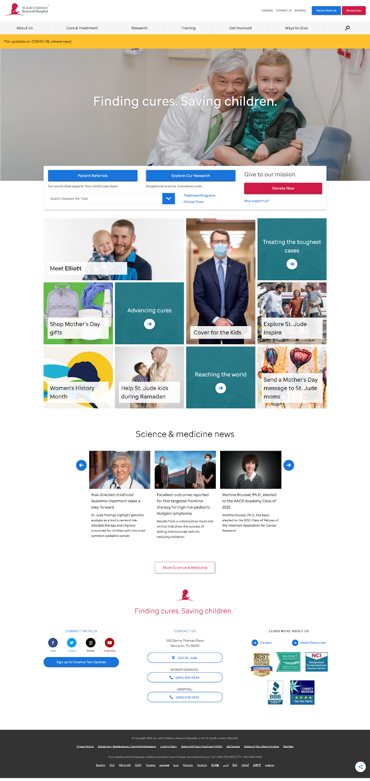
Website Example #2: St. Jude Children’s Research Hospital
What we love:
The homepage “hero image” includes a memorable tagline, “Finding cures. Saving children.”
The homepage “hero image” is actually a video. Bonus: it doesn’t take long to load!
The homepage gallery demonstrates the diversity of reasons someone might have in their organization in a way that is clean, simple, and easy to navigate.
The news section is up-to-date and updated regularly.
The “connect with us” section includes social media buttons and email or text updates.
The “get involved” section breaks down every imaginable format: school fundraisers, sports and fitness fundraisers, workplace giving, video game fundraising, and individual giving.
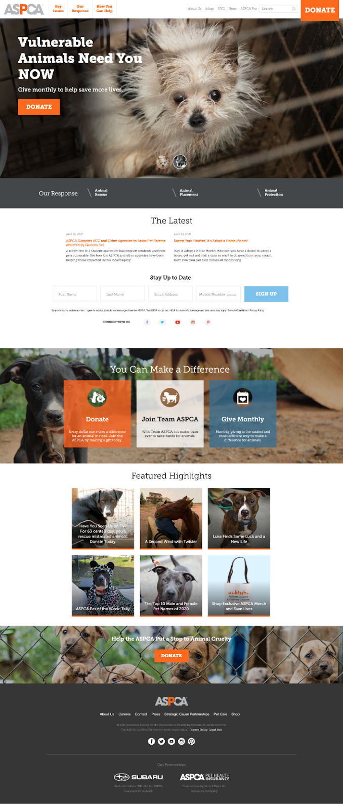
What we love:
The homepage “hero image” CTA is for monthly donations, which boosts donor retention.
Looks just as good in mobile view as laptop.
Includes as a newsletter sign-up without forcing users to leave the page.
Has a strategic partnerships page, that tells supporters other ways they can get involved through day-to-day purchases.
Format is easy to follow: Key Issues, Our Response, How You Can Help.
Donate button on every page.
Heart-melting, high-resolution photos throughout.
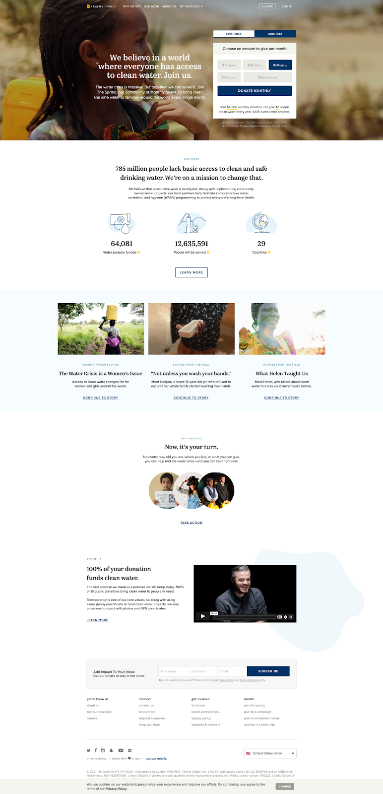
Website #4: charity: water
What we love:
The “hero image” is totally unique, featuring a video background with a donation form.
Navigation is straightforward: Why Water?, Our Work, About Us, Get Involved.
Features a 20-minute “about us” video on the homepage that loads instantly.
Includes custom graphics and animations that are unique to its brand.
Copy is short and conversational throughout, which feels inviting.
Has a “streaming” page, which includes step-by-step inspiration for gamers to livestream and raise funds for their cause.
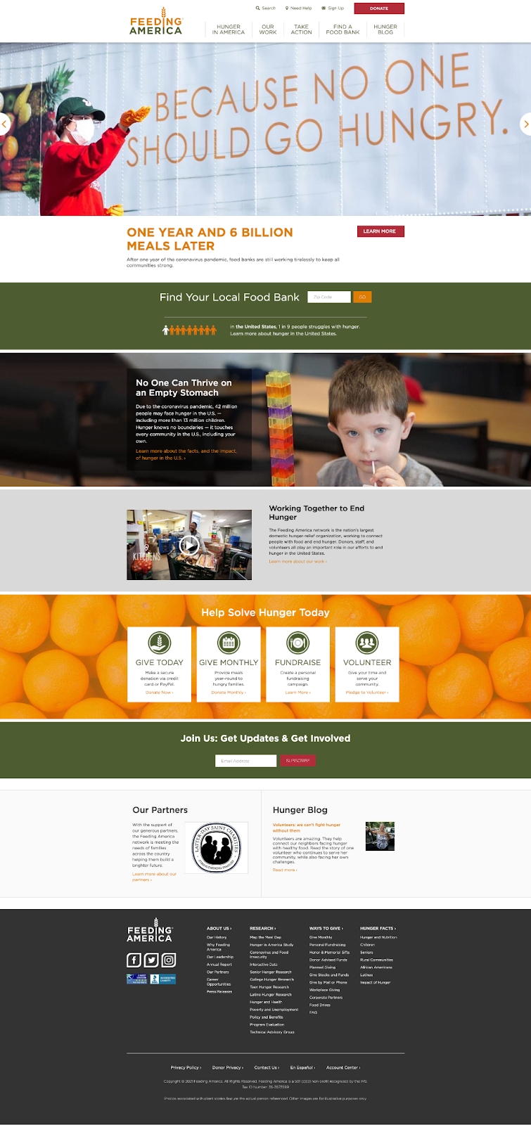
Example #5: Feeding America
What we love:
The homepage “hero image” reports an immediate impact: “ONE YEAR AND 6 BILLION MEALS LATER.”
Includes a 501c(3) tax ID number in the footer, boosting donor confidence.
Humanizes those served on the “hunger in America” page: child hunger, senior hunger, Latino hunger, and more. You can tell the site was carefully made for donors, volunteers, and those served.
Has a “thank you” section, where anyone can send a personalized thank you card to volunteers. Genius!
The blog has a memorable name (“hunger blog”) and is keyword searchable.
The donation form is one simple page that includes an explanation for why monthly giving makes the biggest impact.
There you have it! We hope these beautifully crafted nonprofit websites inspire you.
Are you also gearing up for an upcoming online auction event? We at ZGIVE can help. Please check out competitive online auction software options or contact us for more information at 800-940-2392.


Comments